Feedback
Once the footage had been filmed and into the editing process I showed a group of people what was edited so far and asked if they liked it, if so why? what could be added and what could be changed? This was because the people watching our trailer were our target audience therefore listening to their advice would make it more appealing.
Overall they liked it they said the build up was good, however once the action starts it was over too quickly with the final shot running into the camera, it didn't have a solution at the end like many horrors, referring back to Freitags triangle of equilibrium etc. As I felt the same I sort after a camera to add more footage on the end to come to a solution, or an apparent ending which hides the mystery of the story still so it draws in the audience. This bit of footage was the disposing of the knife, creating questions in the audiences mind, did he kill her? Why's he throwing the knife away?
Our film was originally called Agorophobia, however I thought it was a bit of a mouthful to say so once again I turned to my audience firstly I asked them if they liked the name, many responded with what does that mean? Agorophobia is defined as having a phobia of wide open un familiar places, however it can also be described as the fear of no easy means of escape, which roughly correlated to our film as the girl can't escape the torment and chase. I asked a few people on a social networking site the same question, they were up to date with their knowledge of phobias or they googled the name and replied with' it doesn't fit the plot of your movie.' ( I told them the plot previously.) Pondering over themes of the film the title can relate to the idea of love sprung to mind, this soon lead onto the new title 'Love Kills' which is shorter easier to pronounce and a bit more sinister.
Feedback on magazine and poster.
To receive feedback for both the above we used two groups, one who had seen the trailer and then shown the products and the other who were only shown the products. The overall feedback was that they liked the colours that were used on the poster and cover, those who had seen the trailer loved the idea of using the same type of lettering as the trailer, (continuity) those who hadn't seen the trailer would soon understand why it was used, similarly those who watched the trailer liked the magazine cover using the shot of her reading a letter re-arranged to hold the poster of what's in the magazine. Referring back to my magazine analysis's and magazine layouts the preferred look was with simple text and images on the front page, the less cluttered the better, which is exactly what was achieved with the magazine cover, the only text except the masthead, header and footer is information on the film, promoting it as it's mainly the only bits of text to read, other text uses alliteration which I think makes it unique. When thinking of a masthead we went through possible names that clearly state the use of film, the use of Wrap was clever as at the end of film on the set the director stereotypically calls "That's a Wrap". Which ties perfectly with a film magazine. The use of the film strip was picked out by a few people as clever and clearly displaying it's a film magazine.


Editing
Editing
Once the footage was copied onto the mac and Adobe premier pro was opened and imported the stream of clips I dragged them into the video bar and started to cut and re-arrange clips, using the razor tool to cut and the selection tool to move them, the zoom in and out made for more precise.


To make clips shorter I used the rate stretch tool to shorten the length of the clip, this can be used to lengthen clips also.
 To insert a title.
To capture the green screen, I opened up a trailer on Youtube paused and print screened the image using shift apple control and 4, this then saved onto the desktop where I imported it and dragged onto video bar and re-adjusted the size and rendered it.
In our trailer we used many fade to blacks this was achieved by going onto video transitions, dissolve, dip to black.
youtube - youtube converter -- import drag to audio
To get the audio we used youtube as it has a variety of options of music to then retrieve the mp3 we converted the file and downloaded it to then import.
To achieve the 'SCORPION EYE' I used the same step as creating the title.

 Step 1: Background
To help us conjure up a plot days before this project started we went out and took photos of possible locations for our film to be set. This image is an ideal image to be used as our film poster as it leads into darkness with trees creating an arch as if they are creating a tunnel into the darkness.


 Step 2: Protagonist and intruder photos


Once the footage was copied onto the mac and Adobe premier pro was opened and imported the stream of clips I dragged them into the video bar and started to cut and re-arrange clips, using the razor tool to cut and the selection tool to move them, the zoom in and out made for more precise.


To make clips shorter I used the rate stretch tool to shorten the length of the clip, this can be used to lengthen clips also.

To capture the green screen, I opened up a trailer on Youtube paused and print screened the image using shift apple control and 4, this then saved onto the desktop where I imported it and dragged onto video bar and re-adjusted the size and rendered it.
In our trailer we used many fade to blacks this was achieved by going onto video transitions, dissolve, dip to black.
youtube - youtube converter -- import drag to audio
To get the audio we used youtube as it has a variety of options of music to then retrieve the mp3 we converted the file and downloaded it to then import.
To achieve the 'SCORPION EYE' I used the same step as creating the title.

 Step 1: Background
 To help us conjure up a plot days before this project started we went out and took photos of possible locations for our film to be set. This image is an ideal image to be used as our film poster as it leads into darkness with trees creating an arch as if they are creating a tunnel into the darkness.
We decided that the colour
scheme of our poster should be predominantly blue and white to create an eerie moonlit feel.
To make the photograph more suitable we adjusted the hue and saturation of the photo and tinted it blue. At this stage the photo seemed too light so we made a black background and adjusted the opacity to about 26% then added a dark vignette border which is common in a lot of horror film posters and can give the effect of something emerging from the darkness. This will also help the main image of the protagonist stand out.
 Step 2: Protagonist and intruder photos
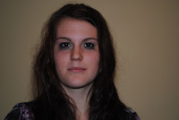
In the last day of filming we took photos of the two characters appearing in this trailer. The female protagonist who is played by Helen Palmer and the intruder portrayed by Joe Phipps. We took a lot of different photos and out of about 20 we decided this one was best for Helen's character. Her face is serious and looks directly into the camera, her hair is messy but is kept out of her face so it stands out more. The eye make-up is smudged and uneven to give the impression she has been crying or panicking. Firstly, we used the magic wand tool to remove as much of the background as possible which was easy because of the contrast of dark hair on a yellow wall. We then cut around more precisely with the lasso tool with a high feather so her hair blends into the dark background and looks as realistic as possible.
These three images show the stages of development from the original cut out of Helen to the one which we used on the poster. In the second image I used the clarify tool and set the maximum number of 20.0 which emphasises the shadows which were already there making her face look slightly more sunken. I then duplicated the layer, added a blue hue then altered the opacity to very low so the skin seems pale and cold. In the final image I have used the warp brush to make her head narrower and a darkening brush under the eyes and on the cheek bones to give a gaunt almost skeletal look. The corners of her mouth have been altered to remove any hint of smile that might have been in the photo and her lips have been made pale and thin.

Analysis of Film Posters
Analysis of 3 film posters.

Layout.
The first two posters have the actors in the role of their characters in the centre. These are the protagonists, therefore it makes sense for them to appear on the poster. However the third poster is an exception to this and if you have seen the film you will become aware of why. The use of the landscape and not use of actors still makes the audience wonder why are there many cars but no people? Which are similar questions audiences ask themselves when looking at the other posters, why is this woman being dragged to hell? why has she only got 3 days? Similarly they may ask why is this man wearing a mask and carrying a weapon? Each poster has its own captions, Friday the 13th's caption- 'Welcome to Crystal Lake' is at the top, so in theory you will see the caption before the person this shows that this is the location where this character either lives or strikes. Drag Me To Hell- 'Christine brown has a good job, a great boyfriend and a bright future, but in three days she's going to hell' is under Christine but above the title of the film. The happening captions are in the clouds which read; 'We've seen it, We've seen the signs, Now.. it's Happening' as this is in the large dark clouds may indicate that what ever is happening is to do with the clouds or nature. These all arise questions intriguing the viewer. The images used are in continuity of the film, what you see on the poster is what happens or a result of what happens in the film, with Friday the 13th the character is dressed in dark clothing which will blend in the background of the dark woods once out of moonlight, which is currently behind him surrounded in fog, gives the effect of eeriness, holding the weapon displays the character as the villain in the film,this is reiterated as he is wearing a mask to hide their identity. For the 'Drag Me To Hell' poster in the background there are homes, this connotes that this isn't a girl lost in the woods type of horror the horror occurs in civilised area. You can clearly see by her expression she is in pain this is emphasised by the hands or rotten flesh, this is also a sign of hell as well as the fire at the bottom of the page. Finally the image in 'The Happening' poster is of abandoned cars either side of the road with large dark clouds in the sky, the image doesn't consist of much but the meaning is deeper.
Typical of many movie posters the name of the film is at the bottom of the poster, this is because the image commonly takes up the majority of the page, these are typical conventions of a film poster. This is because looking at a poster from top to bottom the title is the last thing you see. In some posters instead of writing un-familiar producers they display other films the viewer of this particularly movie may have seen, for example, ' from the producers of the Texas Chainsaw Massacre.' The font used at the bottom of the first two posters is a universal font, majority of movie posters you find have the same font, if the lower case of letters are used a different job involved in filming is used fir example, director is created by just one letter. The release date is also at the bottom of posters directly under the name of the film so you know what to see and when to see it.
Target Audience
Our magazine will be made so that it targets all audiences, it will feature films from all genres, new releases and all time classics as well as animated films. Creating this wide audience more people will be interested in buying the product as you get more for your money than buying one type of genre.
Magazine layout feedback
To distinguish which layout my partner and myself would use, we looked at the results of my questionnaire, out of my 3 designs the first two drew with equal number of 12 votes each. Therefore I will design my layout with features of both of these, to reach out to my audience.


Magazine layout 1

Magazine layout 2


Magazine layout 1

Magazine layout 2
Magazine layout 3
When I interviewed a few people into why they picked they preferred the first two layouts to the first the response was because of; they liked the main image in the centre of the page, with the first layout I was told they liked to see more of the main image, with a little information of what's inside. Others liked the second layout because the smaller images interest them as it displays different genres inside. The third layout received the fewest number of votes, I asked why this was and people replied with the long list of what's inside.
Empire magazine analysis
 EMPIRE magazine cover.
 Empire is in a white font over-ridded with the electric blue featured in the center of 'Iron Man'. The colour creates the sense of strong forces of electricity.
The date, issue and price is in the space between the 'M' this is in the same place in every issue, this is where existing customers will expect to find it.
This also goes with the website always being placed under the 'E'
The background is plain black contrasting well with the white font, no attention is subtracted from the character. The film the character is from is written across the chest, sticking to blue and white, (these colours contrast well against the red suit) under this is a tagline, which refers to the previous prequel with writing the 'same attitude' suggests the audience have seen the first film, however looking at the rest of the line, the audience know they can understand what happens.
Empire aims to attract customers with large images taking over the majority of the page. Often the image covers over a letter of the masthead typically this letter is 'P' and sometimes 'I' as the images are nearly always central to the page.
Under the prodominent image there is 'Plus Three Amazing Exclusives' encourages readers to see what they have to say about the below films.
Along the bottom is a wide footer giving insight into what else is inside as the majority of the cover has been used. Next to each image of a character from a film is the name of said film and a few words to encourage further reading.
The barcode is up the right hand side in the corner, this isn't conventional for Empire magazine, the barcode is often where ever there is enough space to put it but they are always in the bottom half.
The pug sticks with the colour scheme of blue and white. Those who are interested in films will be attracted to this as they review films of 2009. It's elevated above the image not touching anything, because of this it attracts some more attention than it would if it was piled next to a list.
The line next to the image introduces the character.
Fangoria magazine analysis
 Fangoria, is a magazine deadicated to horror films. The font is clear and outlined in red to stand out, this may represent blood. The price is small under 'Horror Video', as it's so small its possible that they are not trying to attract new customers but continue selling to their already established customers.
The colour scheme in this magazine consists of a few colours, red, white, yellow, green, blue and orange.
'Best and Bloodiest' contrasts in yellow font against the black, following the blue 'presents'.
'Horror Video' is in red outlined in yellow mixing with the title and the previous caption.
With the black background it's possible to see a clear close up shot of freddy, a horror movie icon. There is no background distracting you, the large image takes up 2 thirds of the cover suggesting that he is one of the main features.
The corner's cut off, covered by yellow strip saying new horror video guide attracting buyers.
There are 3 smaller images in white boxes representing TV's. These have characters from other horror films inside of them that are featured inside the magazine.
The writing colours alternate from white, yellow, blue and orange, this livens up the black background the headings are white underlined in green, all these colours attract buyers as there's a lot of writing it would be too plain to have in just one colour.
Like most magazines the barcode is on the bottom of the cover up the left hand side.
Max Payne film magazine analysis
Max Payne Film magazine.

The prominent image is a large image of the main character in a snap shot of the film Max Payne. It's made to look as if the gun is pointing towards the buyer.
The masthead is in contrast to the background colour of
dark night sky in white.
Total is in 'F' the word total signifies to the audience that it caters to all different genres of films inside the magazine. This is the magazines house style, as is printing the date, issue number, price and website as nothing obstructs this view.
The colour scheme on this issue are yellow and white font. The yellow text is anything that isn't featured in the magazine e.g. "Plus" isn't what is inside but underneath this in white is a list that's featured. The plus contrast with black and white.
The font of MAX PAYNE is different to the rest of the magazine standing out having it in the middle clearly shows, the text relates to image.
Quite often with large images the text is on the bottom half of the page, this is so the picture is clear and not cluttered with information. To slice the information displayed on the cover further, the footer clearly displays what's inside the magazine without going into too much detail. To separate the words every other words is in bold font. The bar-code is always in the bottom half of the cover, in this issue it's vertical up the left hand side in other issues it's horizontal.
Characters
The Characters:
The protagonist will be Helen, a 16 year old girl who can pass for a few years older plus a smart work outfit along with car keys adds a few years on.
The killer will be was Gary, however due to injury we had to use a replacement, the new actors name is Joe.
Re-edit
Re- edit/ re-shoot
Like many films made there aren't always shots that work well first time, there are always bloopers etc. Therefore there were a few scenes we had to re shoot once we got the footage on the macs when we noticed a few errors.
As the cameras were always busy being booked in and out, we booked a particular day but when we started to film after we finished school that day we discovered that even though it wasn't too dark to the naked eye the video camera didn't have enough light to capture the movement of the running sequence therefore we filmed all the inside scenes then. We then booked the camera out a few days later and re-shot this on the 25th November 2010 3:30pm -4:00pm, I then edited it so it looked darker.
As friends were used as actors who have no experience of acting it took a few takes to get them used to being on camera even after running through directions and dialogue etc. one scene we had to re-shoot was the scene where the girl's laying on the sofa putting the vodka bottle down, this took 3 takes as the first time her hand was too far away and the second she felt uncomfortable and smiled during the filming, however the third take was perfect, the restless sleeping didn't look realistic in this scene so this was re-shot on the 25th November 2010 6:45 as this was an inside scene the time was not essential.
One thing I noticed when looking on the footage on the camera once a scene was filmed which consisted of filming a door opening from both sides was the fact that when we switched from one side to the other the continuity of how far open the door had to be differed so that was re-shot, on the same day minutes later.
One more error we encountered was that as we filmed the girl running out the house at night, (darkness wasn't a problem due to the light on the porch) however as it was dark and only lit by this light it caused a reflection on the window which had to be re-shot in a different position, this was also re-filmed on the same day moments later.
Filming Schedule
October 12th
- Film the setting in day and night
- Forest area to set scene in during the trailer.
- Use pans and zooms.
- Must Be slow to create an eerie feel.
- No actors needed.
October 13th
- Re shoot night setting earlier (at dusk) not sufficient lighting to shoot in darkness
October 29th
- Film front door scenes with protagonist (Still camera looking at door slight tilt to represent something unusual)
- Pick up mail montage, change appearance of arm so it looks like its on different days (Close up on mail, only see hand and wrist)
- Reading letters and putting on the table. (Over shoulder shot then short pan around to see table)
- Actors needed - Helen Palmer
November 14th
- Film the break in
- Gloved hand opening door shot from inside and outside (Pan from letters on table to door, close up on door handle)
- Pick up knife (Close up on knife block, slowly pulls out menacing blade)
- Shadow in frosted glass door (Similar to front door shot static camera, bright kitchen light contrast with dark figure)
- Protagonist wake up shock (Point of view shot from the intruder looking at protagonist, point of view shot from protagonist at intruder, blurry to show awakening from deep sleep)
- Also film alcohol sequence where actor slams a bottle of drink down on a table and rolls over asleep. Under the influence = Vulnerable (shot from the level of the protagonist on the couch. Camera pointing at where the bottle will be put down)
- Actors needed - Helen Palmer, Joe Phipps
November 20th
- Chase scenes through forest (tracking shot of both protagonist and intruder)
- Running out of the house (shot from front, back and side to get different angles of running to, away and past the camera)
- Take photos for poster, magazine and other print advertising.
Film Noir
The crime genre: are usually about solving the mystery of a crime, the protagonist is usually on the side of the law, e.g. a detective.
The gangster genre: (Godfather) usually about the planning of a crime and the protagonist is a criminal.
The primary moods of classic film noir were melancholy, alienation, bleakness, disillusionment, disenchantment, pessimism, ambiguity, moral corruption, evil, guilt, desperation and paranoia.
Protagonists were often morally-ambiguous low-lifes from the dark and gloomy underworld of violent crime and corruption. Distinctively, they were cynical, tarnished, obsessive (sexual or otherwise), brooding, menacing, sinister, sardonic, disillusioned, frightened and insecure loners (usually men), struggling to survive - and in the end, ultimately losing.
Storyline were often elliptical, non-linear and twisting. Narratives were frequently complex,
Film noir films (mostly shot in gloomy grays, blacks and whites) thematically showed the dark and inhumane side of human nature with cynicism and doomed love, and they emphasized the brutal, unhealthy, seamy, shadowy, dark and sadistic sides of the human experience. An oppressive atmosphere of menace, pessimism, anxiety, suspicion that anything can go wrong, dingy realism, futility, fatalism, defeat and entrapment were stylized characteristics of film noir. The protagonists in film noir were normally driven by their past or by human weakness to repeat former mistakes.
Film noir films were marked visually by expressionistic lighting, deep-focus or depth of field camera work, disorienting visual schemes, jarring editing or juxtaposition of elements, ominous shadows, skewed camera angles (usually vertical or diagonal rather than horizontal), circling cigarette smoke, existential sensibilities, and unbalanced or moody compositions. Settings were often interiors with low-key (or single-source) lighting, Venetian-blinded windows and rooms, and dark, claustrophobic, gloomy appearances. Exteriors were often urban night scenes with deep shadows, wet asphalt, dark alleyways, rain-slicked or mean streets, flashing neon lights, and low key lighting. Story locations were often in murky and dark streets, dimly-lit and low-rent apartments and hotel rooms of big cities, or abandoned warehouses. [Often-times, war-time scarcities were the reason for the reduced budgets and shadowy, stark sets of B-pictures and film noirs.]
The females in film noir were either of two types (or archetypes) - dutiful, reliable, trustworthy and loving women; or femmes fatales - mysterious, duplicitous, double-crossing, gorgeous, unloving, predatory, tough-sweet, unreliable, irresponsible, manipulative and desperate women. Usually, the male protagonist in film noir wished to elude his mysterious past, and had to choose what path to take (or have the fateful choice made for him).
Postmodernism
A postmodernism text often mixes one cultural period with another. To understand the text we need to be familiar with both cultural periods and the meaning created by putting them together.
Very often postmodernism favours the more modern culture; the Armstrong and Miller sketch is unusual in favouring the older culture period.
Very often postmodernism favours the more modern culture; the Armstrong and Miller sketch is unusual in favouring the older culture period.
Treatment
My groups idea:
Genre: Thriller/Horror
Treatment: A young women is haunted by her past, as her ex boyfriends jail term is coming to an end she receives poison pen mail. Events start to escalate.
Genre: Thriller/Horror
Treatment: A young women is haunted by her past, as her ex boyfriends jail term is coming to an end she receives poison pen mail. Events start to escalate.
Story board.
 1) 3 friends getting along shot of them playing tennis shows friendship. 2) Long shot of girl receiving flowers from both her male friends, she's forced to make a decision. 3) Female chooses one over the over goes to close up of rejected male. 4) Fades to black for 2 Months later to appear. 5) Close up of females face as she cries stop to which the cameras pans round to male character inflicting violence and pain, shown by the bruises on females face. 6) long shot of male running out of a house he previously broke into and assaulting an old women.
  7) The police are called and the male is arrested over the bonnet of the police car from mid shot to close up of expression on males face. 8) Jumps to court seen where the women testifies against her boyfriend (now ex) 9) Female leaving courtroom close up of males expression. 10) Fades to black. 11) Jumps to females house where there's a pile of letters all similar to each other with one saying 'I will kill you'. 12) Horror, shock and fear across the face of female.
Subscribe to:
Comments (Atom)